Explore the event, don't just read a timetable
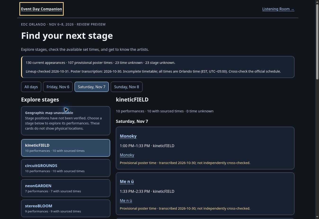
I chose clickable, contextual map exploration as a primary interaction instead of a static image covered with explanatory copy.
Festival planning · In development
A visual way to make sense of stages, set times, and what is happening across a festival.
01 / The why
A set-time poster and a static map are useful reference documents, but they make it difficult to connect places, performers and the moments you want to catch while moving around an event.
02 / In the product
03 / Functionality
04 / Direction
I chose clickable, contextual map exploration as a primary interaction instead of a static image covered with explanatory copy.
Filters should let people ask who is performing at a particular stage on a given day, while preserving clear context when switching views.
Event Day Companion shares an implementation project with Listening Room, but keeps its planning purpose and identity distinct.
Small screens, device accessibility, correct schedules and official source conflicts matter more than decorative map animations.
05 / The process
I scoped the companion as its own product problem and divided the implementation, interface design, quality assurance and release checks among AI-assisted workstreams.
Design and engineering moved in parallel around an agreed map/artist/day contract, with placeholders only where the data or interface was not ready.
Code reviews and viewport testing provide evidence for prototype behavior, but a tested preview is not the same as owner-approved public release.
06 / Where it stands
Interactive exploration has review-build evidence. Production availability and final design acceptance need to be confirmed before treating the companion as launched.